

a rinse. a reset. a return to you.
a rinse. a reset. a return to you.

01. brand strategy
Sarah came to me with this vision that felt like a really rewarding late afternoon surf session, with some gifts for waves. Gentle. Grounded. Full of warmth. She's a hairdresser and entrepreneur with heart, someone who believes in care at every level: for your scalp, your self, and the planet. She wants to make a line that doesn't scream for attention but feels like sunshine you could carry with you.
listening, and aligning
We sat several times and really talked through everything. Her desire to create something kind and generous. Her dream to offer simple, clean haircare products that felt like a ritual, not a routine (I've learned there's definitely a difference). We explored how San Diego has shaped her, and how surf culture and a relaxed way of being inspires her. How she wanted a brand that respected the ocean, the sun, the earth. And the people around her. She surely wasn't interested in trends, either. I could pick up on the fact that Sarah simply wanted something creative and real.
creating a foundation
So I mapped out the soul of the brand. Kindness. Ease. Elemental care. Explored the target audience, researched competitors, and explored trends that are working and what's not working well in beauty and the wellness space, and how to make this brand work long-term. A brand that gives a feeling that lingers like salt water on skin on a long, beautiful summer day where everything seems to be going just right.
You can preview the brand strategy doc that I shared with her before designing the visual identity below.
it’s kindness you can carry. it’s sunshine in your hands.


02. visual identity
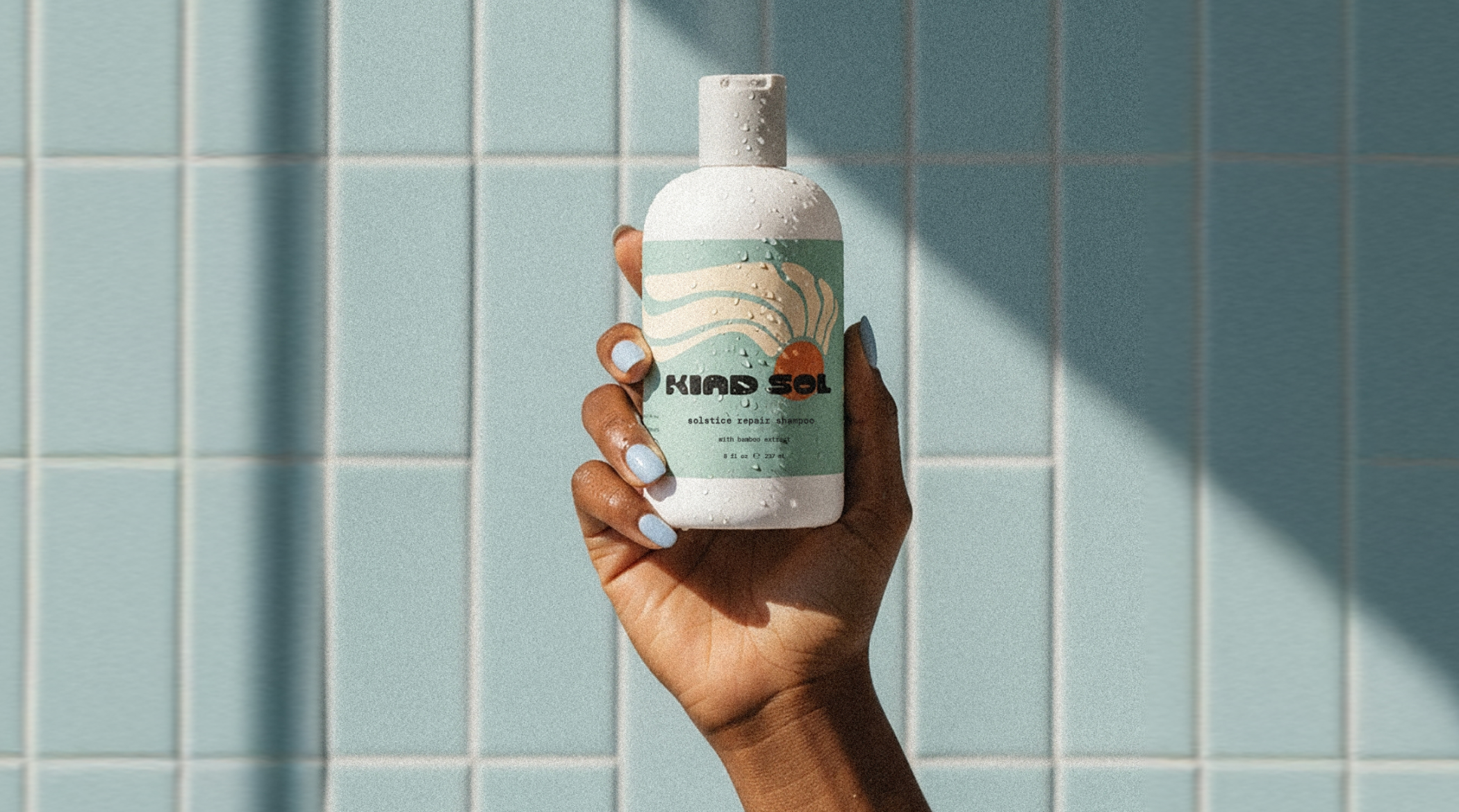
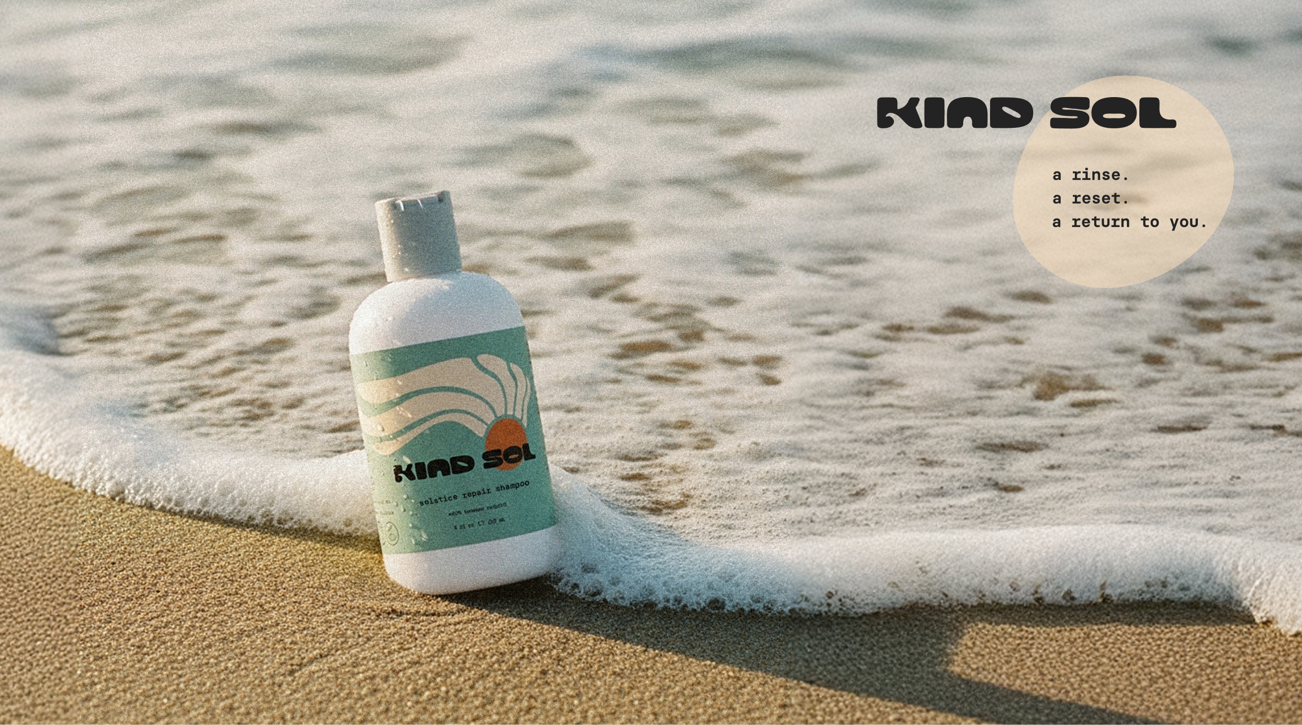
I drew the Kind Sol logo and typeface by hand. A sun with long, wavy hair and a warm, open aura. My intention is that it holds a kind of ease, like it’s been there all along (because, well, it has!)
imperfectly perfect
The typeface is soft and imperfect. My hope is that the human hand is felt in it, to give it a bit more emotion and character.
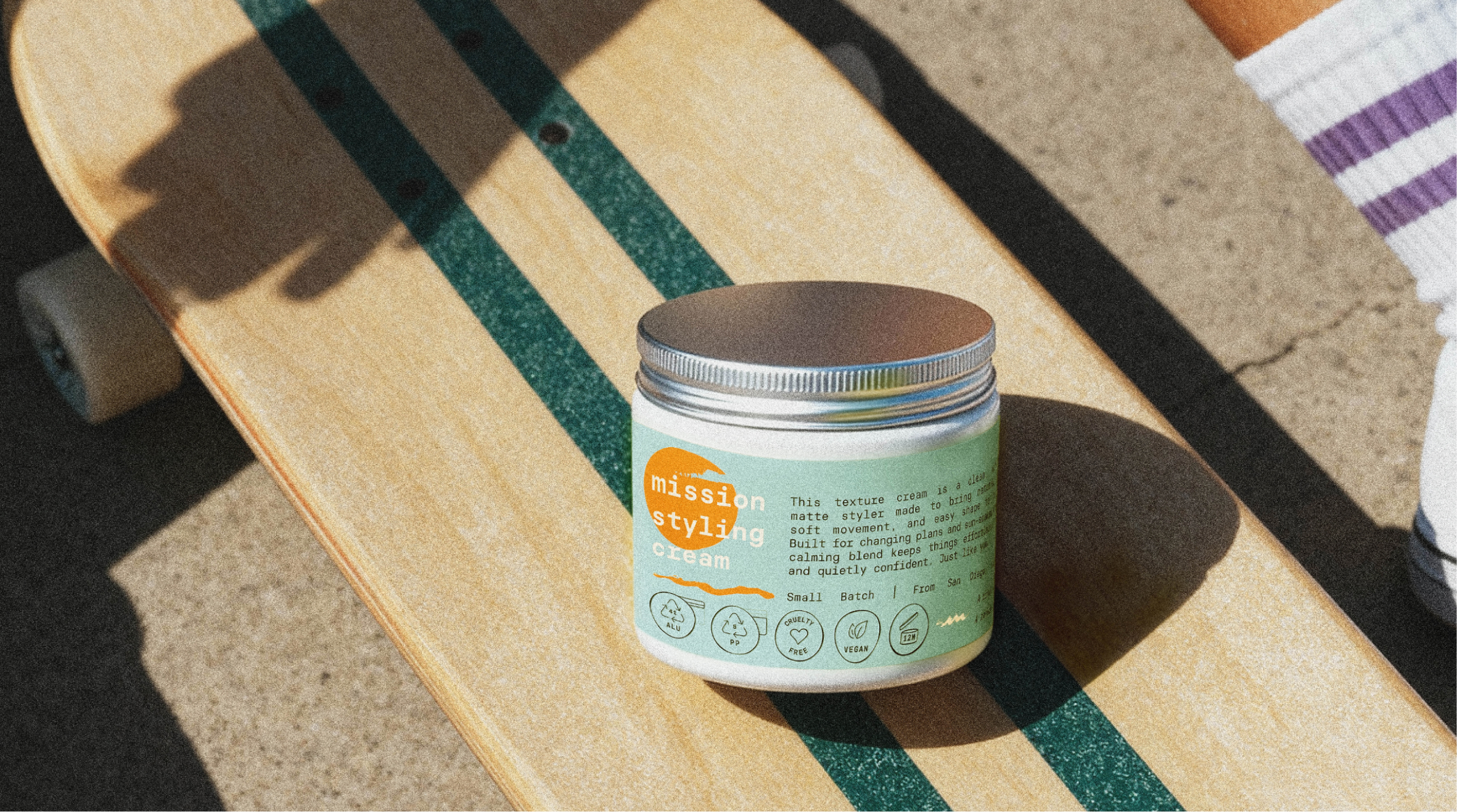
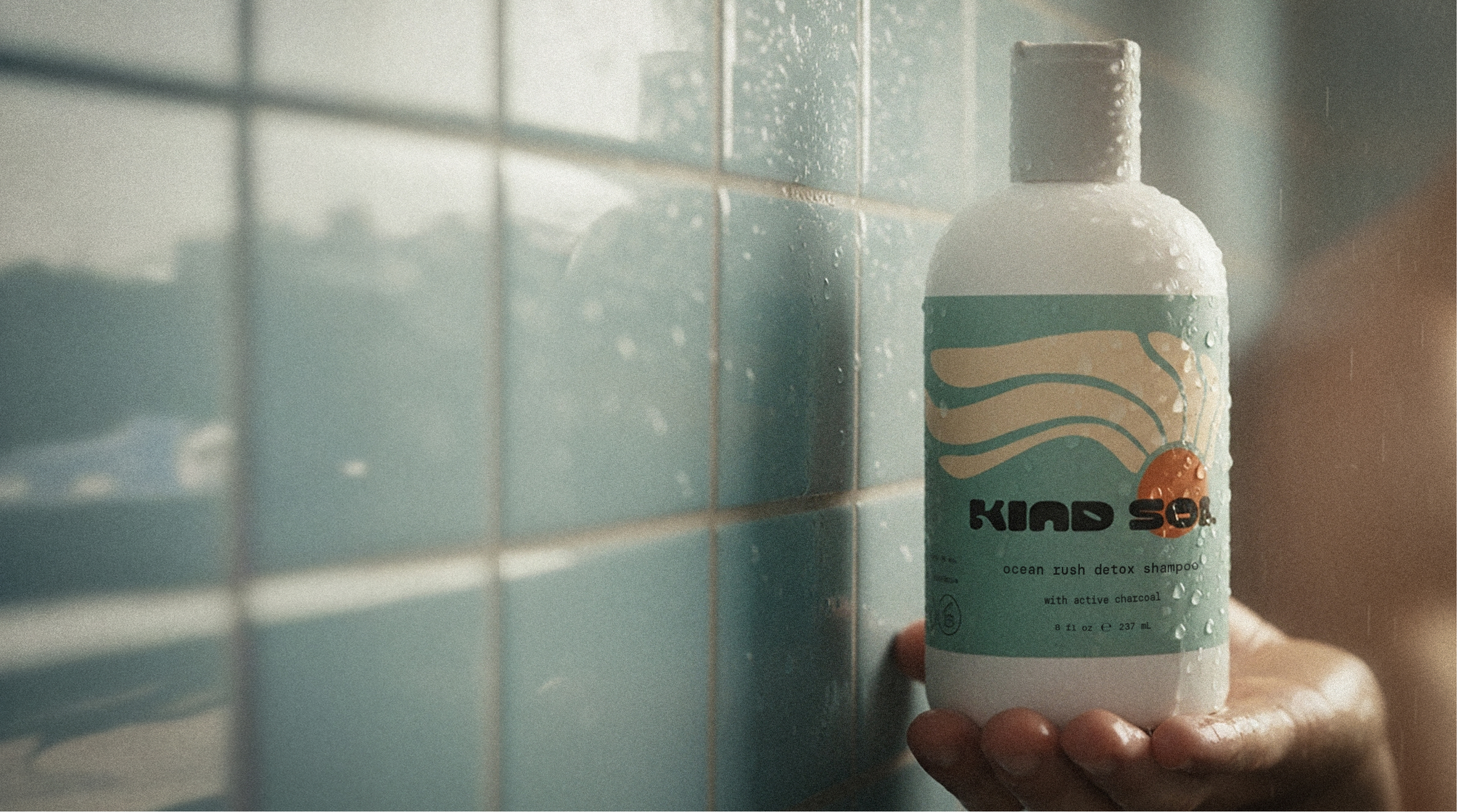
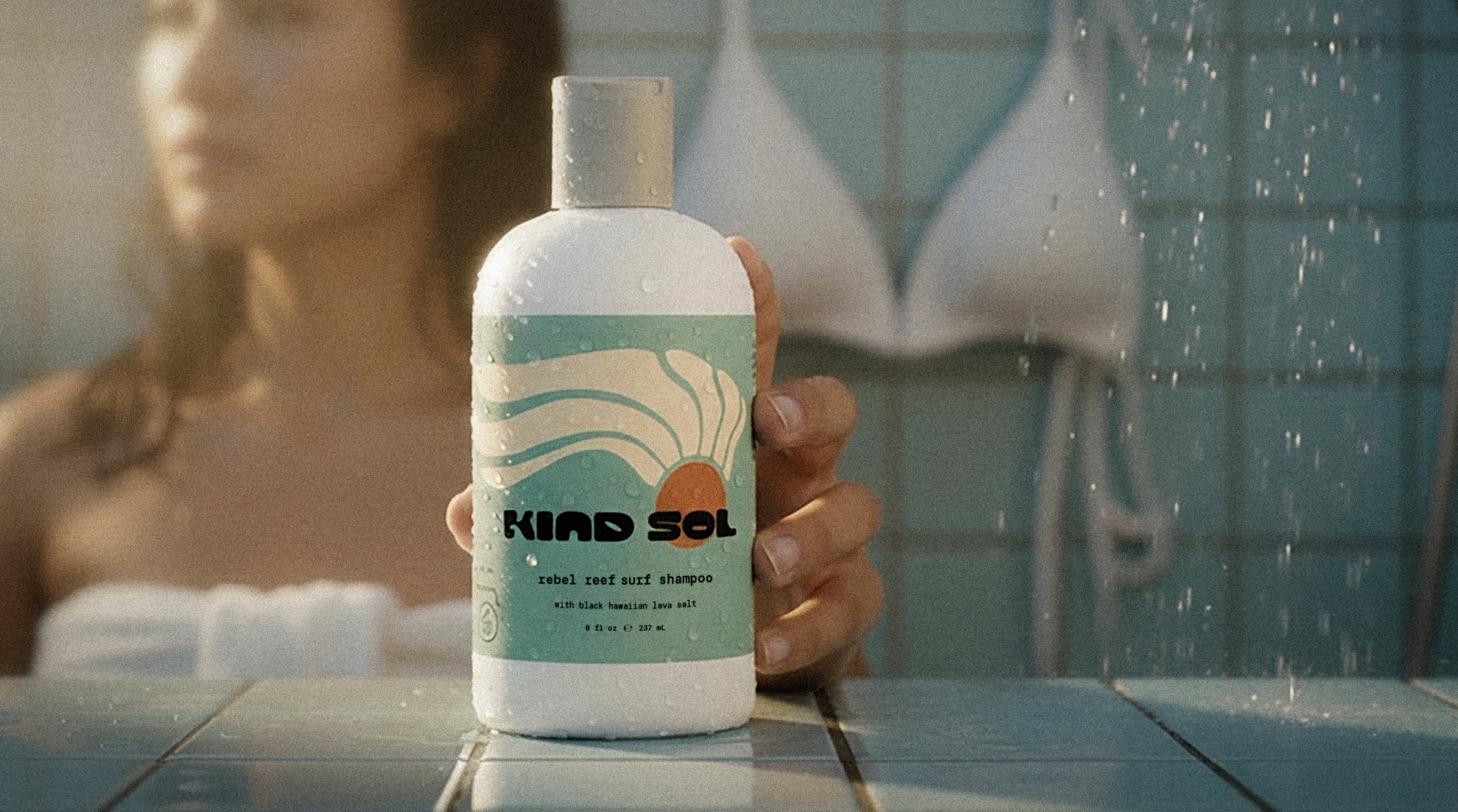
All fourteen labels follow that same feeling. The colors feel settled. The typography stays clean. Body copy runs in a single monospaced, super simple typeface. There’s space to breathe and no need to fill it.
They hold together. On a shelf. In a bag. In the corner of a bathroom. They carry a sense of place. West Coast. Easy.
03. packaging design
From the beginning, I knew this wouldn’t be a loud project. It needed to feel crafted by a local and someone familiar with the culture, and even the kind of neighborhood it was born in.
Sarah wanted her products to visually carry a sense of calm. From the get-go, it was obvious she wasn't interested in a polished look just for the sake of it. She put so much care into each formula, and the packaging had to carry that same level of handcrafted love.
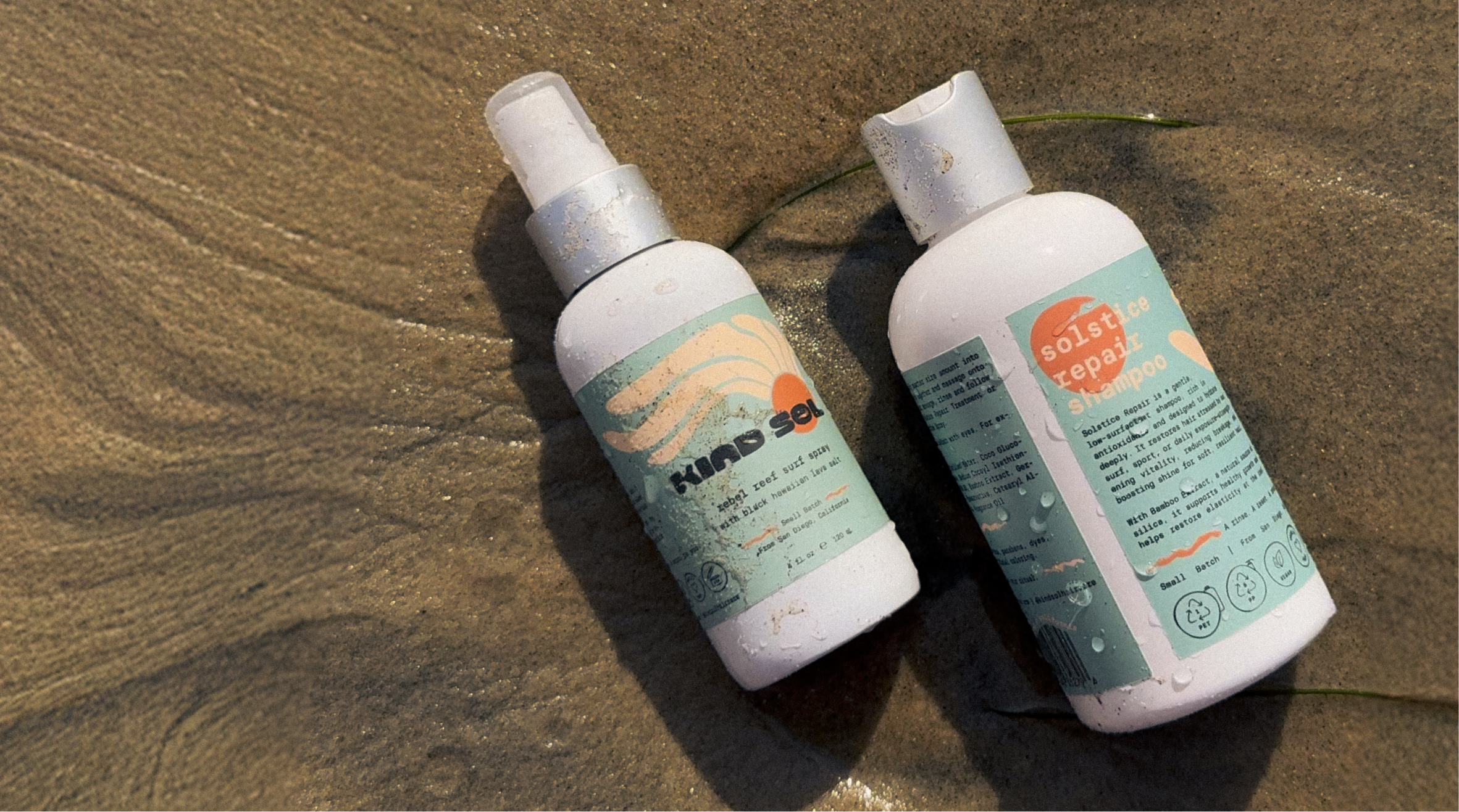
I kept the forms simple, and continued to hand draw icons and smaller elements to bring it to life in a softer way. Each bottle and tub shaped to feel natural in the hand.
The sunmark, wordmark, and clever wave revealed from the "K" was all drawn by hand. A quiet little beacon with loads of warmth behind it. How does one make a haircare label that feels like a breath of fresh air?
Well, it starts with listening.
If you’re building something with heart and need a design that knows how to listen, I’d love to hear what you’re dreaming up.
"like sunshine you can carry with you."
