what if your brand were a person?
And tonight, they’re hopping on a flight and coming to dinner.
You’ve been excited about these plans for weeks—and now your closest friends are about to meet them for the first time.
Your friends are open and loving, but also a very, very tight-knit group.
And they've been asking who's this new buddy that we've been hearing all about.
How do you describe this person?
Are they healthy? Vegan?
What’s their background? What are they rooted in? What do they stand for?
What kind of presence do they carry when they walk into a room?
Are they magnetic and funny, or thoughtful and grounding?
Are they the one who tells great stories—or the one who knows when to sit quietly and let you breathe?
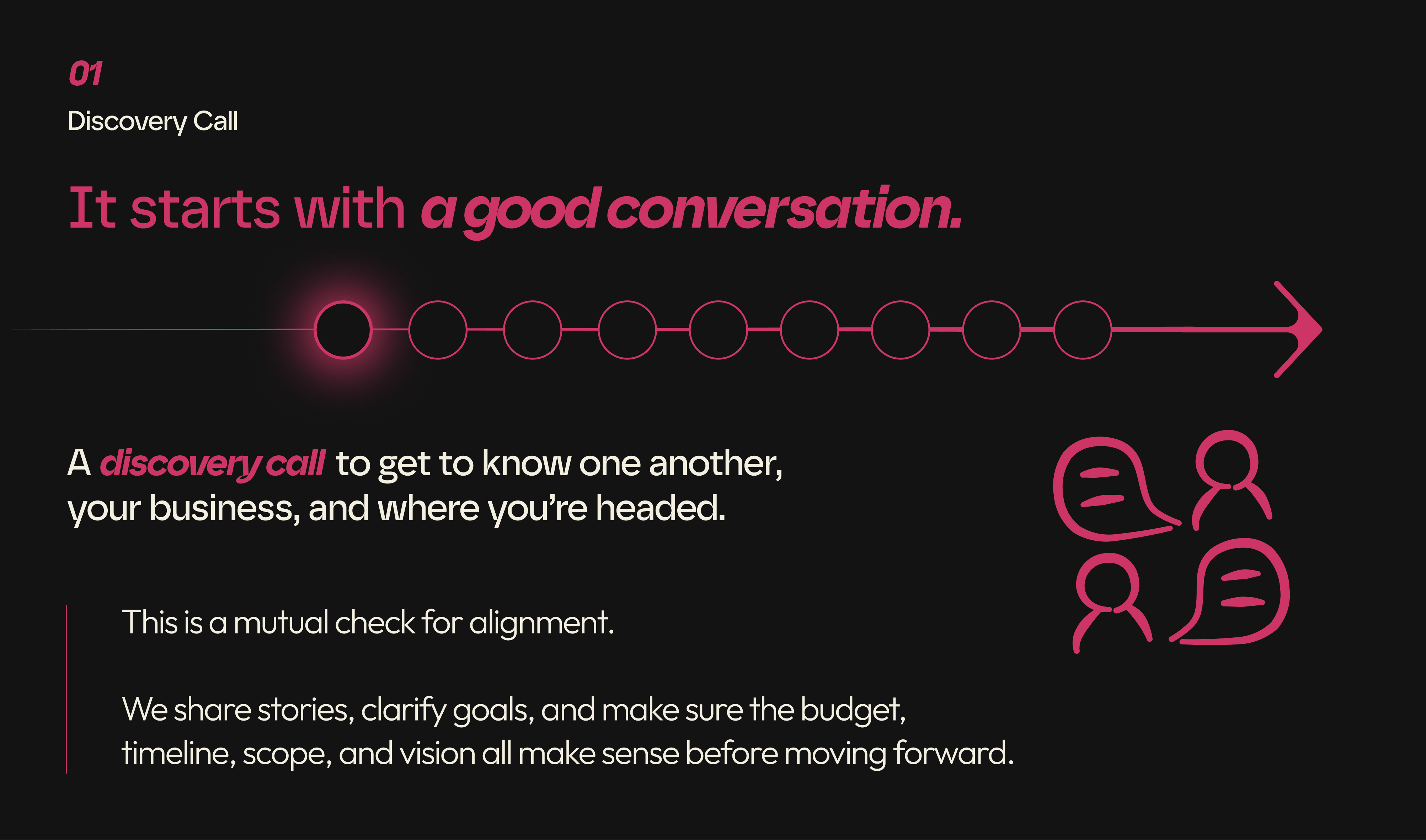
That’s the space I live in before anything gets designed.
Before logos. Before moodboards. Before mockups.
I start by listening for personality.
I get clear on the tone, the rhythm, the way the brand feels—not just how it looks. Is it confident? Witty? Comforting? Intuitive? Is it more mother or more father? Is it loud or quiet? I also wonder what type of music it would listen to.
What words would it use—and what words should it not use?
(Funny enough, I’ve been working on removing the word should from my own vocabulary.) How about... what words might feel completely out of alignment?
This is the real work of the brand identities I create.
And it’s where Virtū began.


sketch to feel, not to finish
Virtū is a modern food company built for people who care about what they put in their bodies. Healthy, functional, and unreasonably tasty.
I first discovered it in San Diego during a work meeting at Lovesong—a café I go to often when I need to shake up my creative energy. I work from home most days, but sometimes I just need to be in a new environment. That day, I walked over to the fridge, looking for something quick and clean.
What caught my eye wasn’t a logo. It was the food itself. Also, there was no logo, ha!
There were a ton of colorful layers.
Layered with fresh ingredients. It looked alive.
Like something that had been thoughtfully made—without needing to shout about it.
I’ve been eating mostlyyy healthy for years now, and I’m incessently on the lookout for better snacks—especially ones I can grab while working from a café or biking or skating around town. So I picked one up, ate it, and immediately felt how good it was.
That’s all I needed. I sent a simple message to the Insta account that said something like:
“I love this food. Thank you.”
No pitch. No agenda. Just appreciation.
That turned into a conversation. Then a workshop over some time. And then, I was all in. I love good alignments like that.
We didn’t start with design. We started with meaning.
One-on-one sessions with the founder—diving into values, audience mindset, future products, brand tone, and emotional resonance. What this brand already was, and how to help people feel that before they even take a bite. Even more important, we discussed in great detail where the brand deserves to be and where he can see it heading.
From there, I built the foundation: a full brand strategy deck with brand pillars, tone of voice, language to use and avoid, early packaging concepts, and ideas for how the brand could evolve in new spaces—vending, in-flight, digital, and beyond.
And from that clarity, the creative process started to unfold.
That’s when I picked up a pencil. (That pencil is a UNI Kuru Toga 0.5—the mechanical pencil I’ve been reaching for more and more lately. Thanks Airship Notebooks!)

bring it into motion
Once I have something that feels close, I take it into Adobe Fresco. It’s vector-based and it lets me keep the energy of the hand-drawn lines.
I refine shape, scale, balance—always checking back with the original intent.
This part isn’t about “cleaning up.” It’s about letting the right version of the idea rise to the surface.
I absolutely love this part of the process.


designing with emotion: color and typography
The color system for Virtū came from a mix of real ingredients, emotional theory, and long-term strategy.
Spirulina blue, burnt pitaya, cherry crush—these colors weren’t random. They came from the actual food. But the work didn’t stop there.
I studied how each color could carry energy, trust, calm, or appetite.
How they’d read on the future packaging, in digital, and across new product lines down the road. How does it read printed on a shirt or wrapped across a food delivery van? How does it look when paired with a local coffee shop's branding?
It had to make sense for the client’s goals, too. He needed something bold enough to stand out, but refined enough to feel reliable. Something that could shift between a Wholefoods shelf and an in-flight meal to Paris and still feel connected.
The typography followed the same thinking.
I used a humanist sans-serif—modern, clean, but still warm. It holds space, but it doesn’t overstate. That balance was really important.
Research from Monotype and Neurons helped validate that, too. Their work on emotional design backed up the feeling I was aiming for—how the right type can actually build trust, and how layout can influence memory and perception.
That’s how I approach visual identity. Not by layering on aesthetics, but by listening to what the brand needs to say—and making sure every element supports that message.


every part tells the story
This is just a small fragment into the creative process of building a brand.
And the final brand identity for Virtū isn't here yet, but it sure is coming soon. Oh, and all these sketches and mockups? It’s part of it too.
Every step is connected. Strategy. Exploration. Listening. Letterforms. They all carry weight. That’s what I mean when I say design with intention. It’s not about perfection. It’s about presence.
If you liked this behind-the-scenes look at the process, you might enjoy how I brought the same intentional approach to Enaytime—a non-alcoholic beer brand inspired by freedom, adventure, and 2.5 years of sobriety.
Ready to create something meaningful together?


