missed trains and vivid work
Milan has shaped me more than most places. I have family there, and some of the best meals of my life have happened around their tables. But it’s much more than family time that I love. The city moves with structure, with detail, with a kind of quiet authority. You don’t have to look for design there—it’s absolutely everywhere, even buried underground in ruins. The new Milan is a bit trendy, but still incredibly thoughtful. Design is just built into the bones of the city.
As someone trained in architecture, the connection hit immediately. Every few blocks, another building I remembered from school. But seeing them in person didn’t feel like checking boxes and like I've achieved something. It felt like everything I had learned was finally making sense. I don't even think I remembered being taught 99% of the learnings I had uncovered with each building, and that really goes to show how much does one really know until they go and see it for themselves? The scale, the materials, the rhythm of how one space leads to the next in a perfect flow—it all became part of how I see now.
It was almost too much. Every corner held something beautiful. Not just visually, but emotionally. I kept asking myself: how does one even hold this much beauty inside at once? You know those sunsets that are almost too gorgeous? Times that by a 1000 for me. Was I even built to absorb it? My system felt overloaded in the best possible way.


constantly flowing inspiration
The Duomo di Milano, of course, dominates the city’s identity. I have drawn it many, many, many times. On one particular Italy trip, I became so absorbed in sketching that I missed my train to Verona for a visit to my cousins. I actually didn't mind. I mean my wallet did as a youngin', but my heart was obsessed with the details of the Duomo. The drawing I made that day would later become the basis for the cover of Duomo’s VIVID swatchbook. It remains one of my favorite sketches.

approach and process
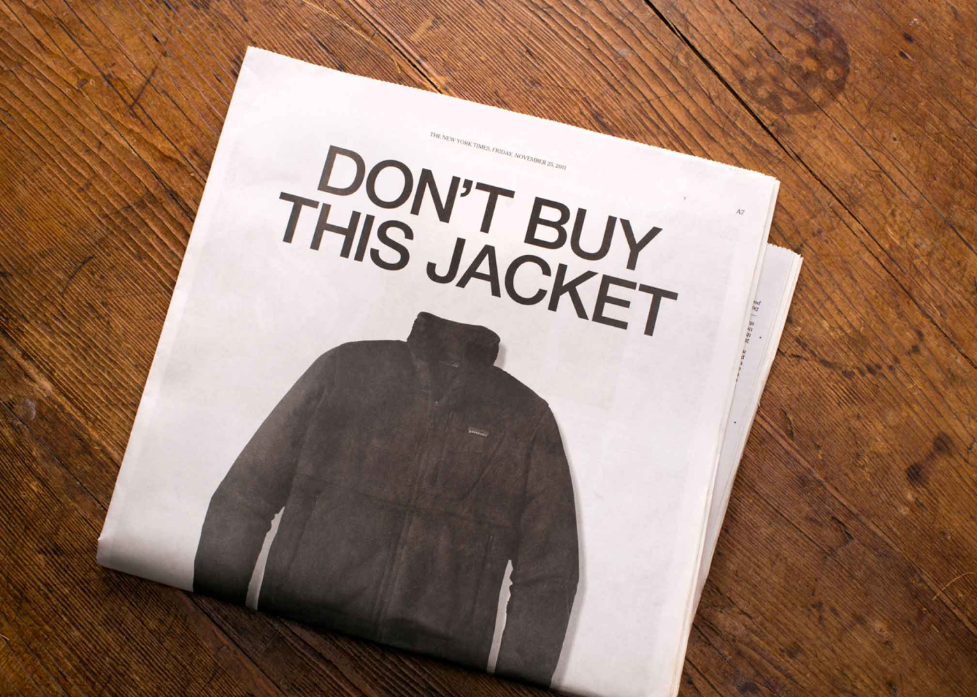
Duomo’s VIVID collection required a distinct visual system. I had already developed the core brand identity and packaging, but this extension needed a different kind of expression. The product itself is bold, high-performing, and rooted in strong color narratives. The design needed to reflect that without exaggeration.
I began with pen and ink. The sketching was loose on purpose and I didn’t clean it up or try to make it precise. I let the lines move the way they wanted, trusting the form would come through repetition and rhythm. I added watercolor next—light washes, nothing overworked. Once digitized, I brought it into Photoshop and Illustrator, where I introduced explosive layers of color pulled directly from the VIVID collection. Not to match the tones exactly, but to echo the energy behind them.
The visual language came straight from my own time in Italy—sketching in the street, missing trains, soaking in the details. Just a real lived experience, and a design system that could hold all of it. Below is another sketch I did there that's on the packaging for the Duomo sample box.


intention, always
A swatchbook is a technical tool. It has a job to do. But that doesn’t mean it needs to feel cold or mechanical. I approached this one like I would any piece of design: with obsession. The layout is simple. The grid is clear. Swatch loops are placed with intention. Type stays out of the way but is bold and structured.
What mattered to me was that it felt made. Like someone actually cared how it came together. That you could flip through it and feel that each decision—every line, every piece of color—had some weight to it.
The inside didn’t need to shout at all, as I let the cover do all of the talking. This was a very cool project. Just boldness and some love, and a client that was willing to push the boundaries a bit on what a traditional hair color swatchbook could be.


let's make things that matter
If you’re building a brand in beauty, design, or anything that deserves to be seen and felt with intention, I’d be delighted to connect.
You can reach me directly at johnnylemoine.com/contact, or explore more of the Duomo project here.