

imagine cacao. now imagine light, love, + creation.
imagine cacao. now imagine light, love, + creation.
01. alignment
Two architects connected through light, structure, and devotion to the human experience. From my first conversation with Cacao Studio, it was clear this would be more than a brand. It was an exploration of how design itself can become a ceremony of light.
Cacao is a studio devoted to the craft of architecture, but also to the deeper work beneath it and how spaces can shape emotion, behavior, and connection. That idea became our starting point. Our conversations moved from drawings and elevations into the philosophy of light, how it enters a room, and what it does to the human spirit once it’s there.
My role was to give that spirit form. To translate their essence into something tangible. Something that felt both timeless and alive.
"art and craft. for the sake of humanity."
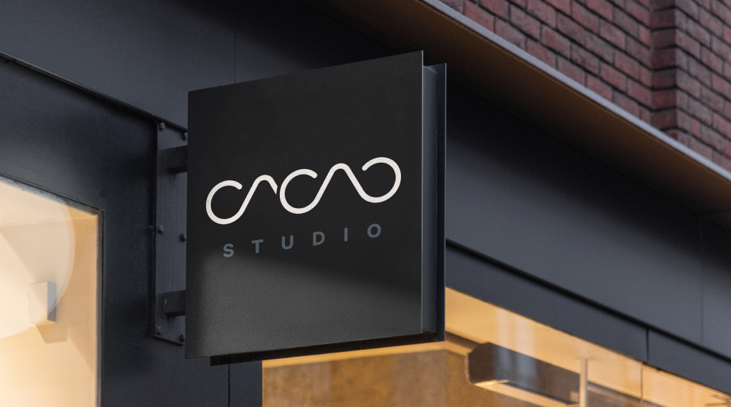
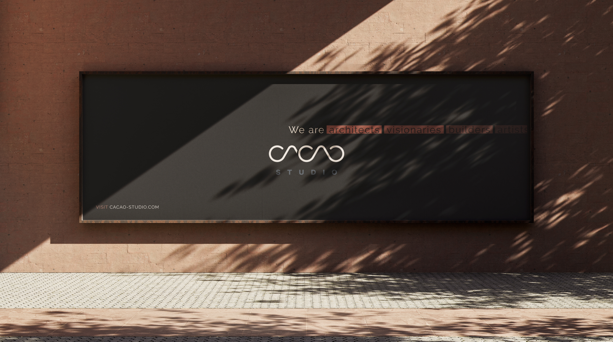
02. the brand
Cacao’s brand needed to breathe like their work does, with balance, precision, and heart.
Raleway became the foundation, a nod to the architect’s line, clean, measured, and beautifully intentional. Roboto carries the finer notes, lending softness and legibility to every paragraph. The color palette of slate, corten steel, cream, and a soft cream neutral backdrop, reflected both the earth they build upon and the light they chase within it.
The layouts draw your eye the way sunlight travels through a building, slowly revealing texture and depth. Even the custom icons, minimal and abstract, were created as quiet metaphors for Cacao’s five pillars of light (their brand pillars) crafted to complement the brand without ever speaking over it.
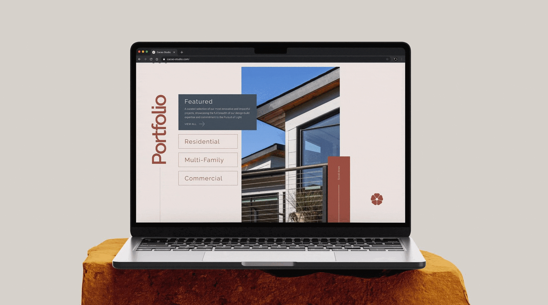
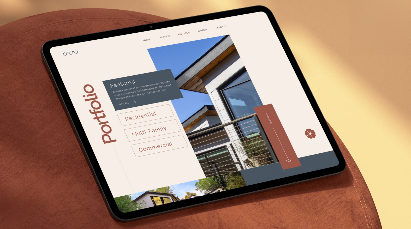
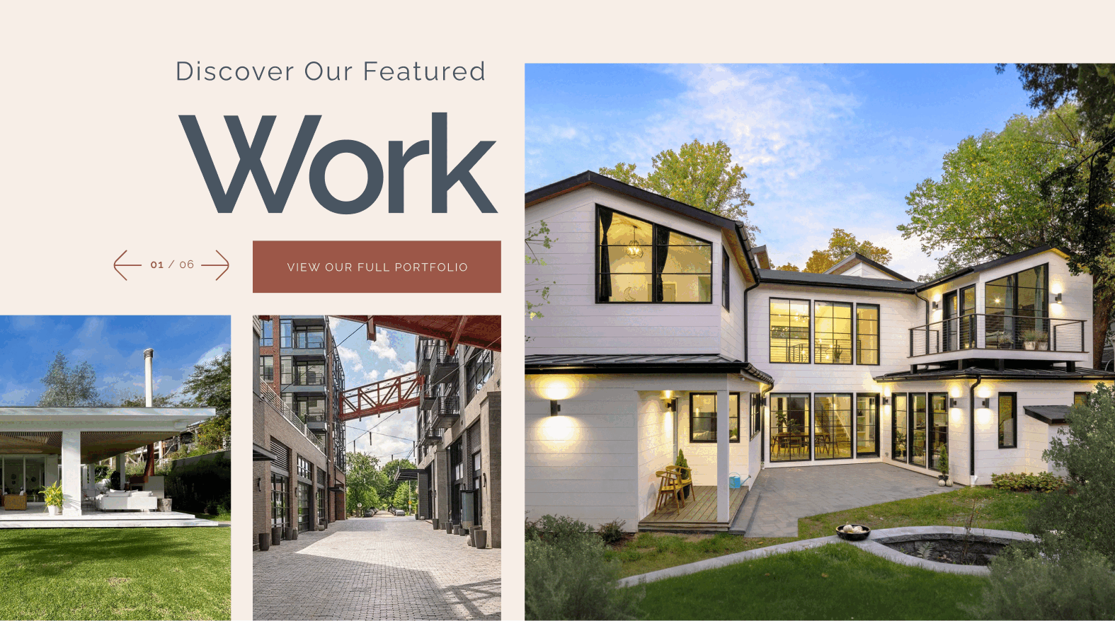
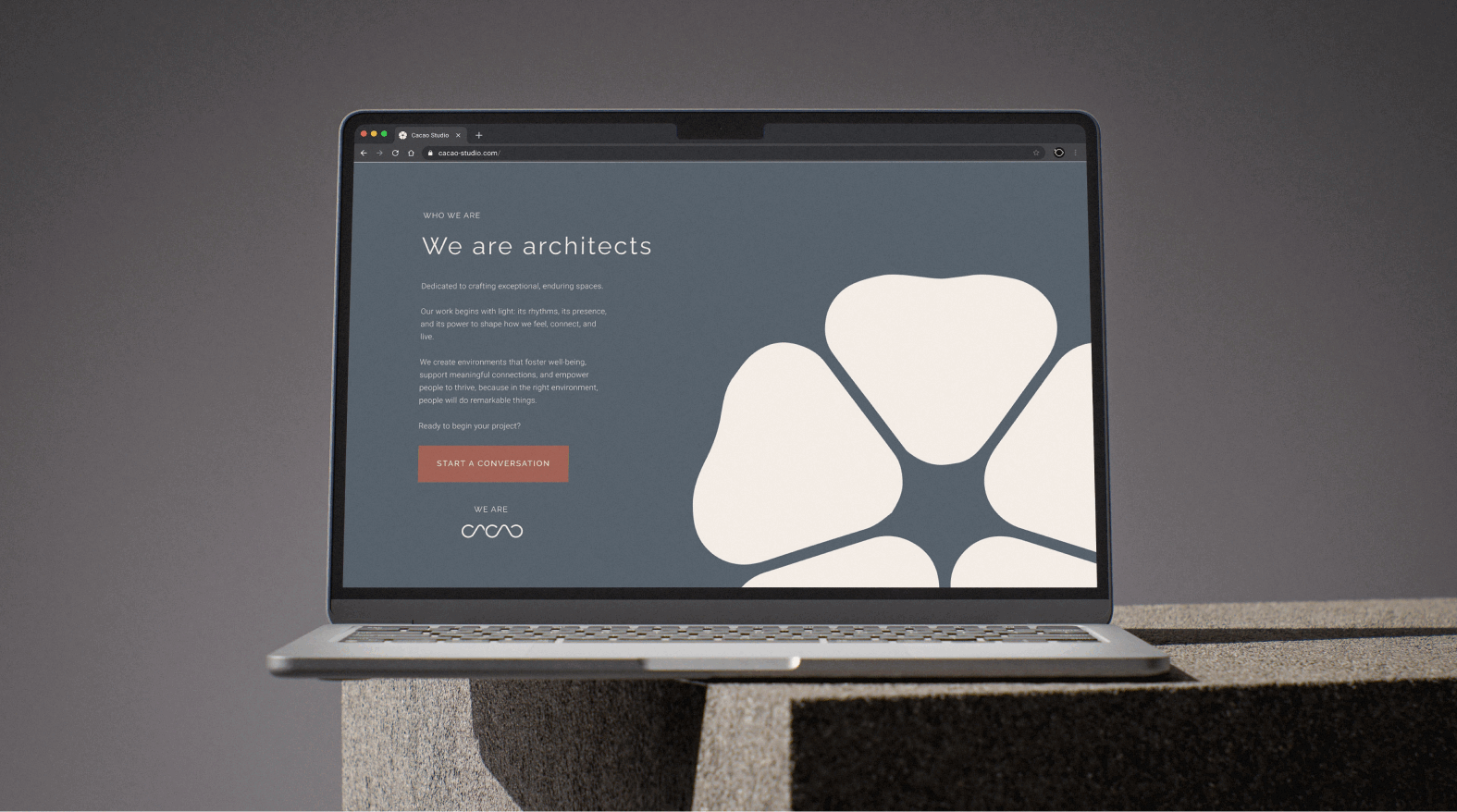
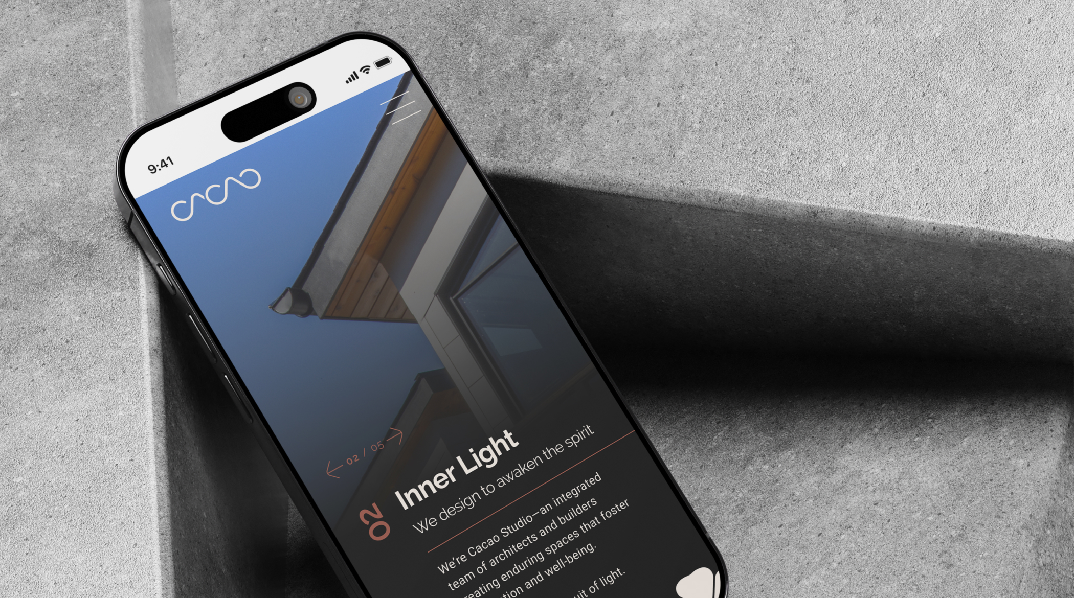
03. the website and a huge mural
When I began designing the website, of course I approached it like designing a building. With 15 years of architecture under my belt, this is my typical way of going about most work. Every page on the site needs to tie into the bigger system, the proportion, rhythm, and air of the brand. I wanted the experience to feel like stepping into one of Cacao's homes, which is quite calming, grounded, and simply guided by light.
And each section of the site unfolds with intention. The grid system feels architectural, but the movement feels wildly human. There’s structure, but also room to meander. The interface disappears so the work can breathe.
The journal became a place to expand the story. Not quite a blog, but an archive of thought, like essays on craft, process, and the pursuit of light. It’s an extension of Cacao’s philosophy, living online with the same care as their drawings on paper.
Cacao is more than a name to me. It’s a plant I’ve sat with in ceremony for years. It’s part of my creative practice, something that opens the heart before creating. I first connected with it in Costa Rica and brought that ritual home to San Diego.
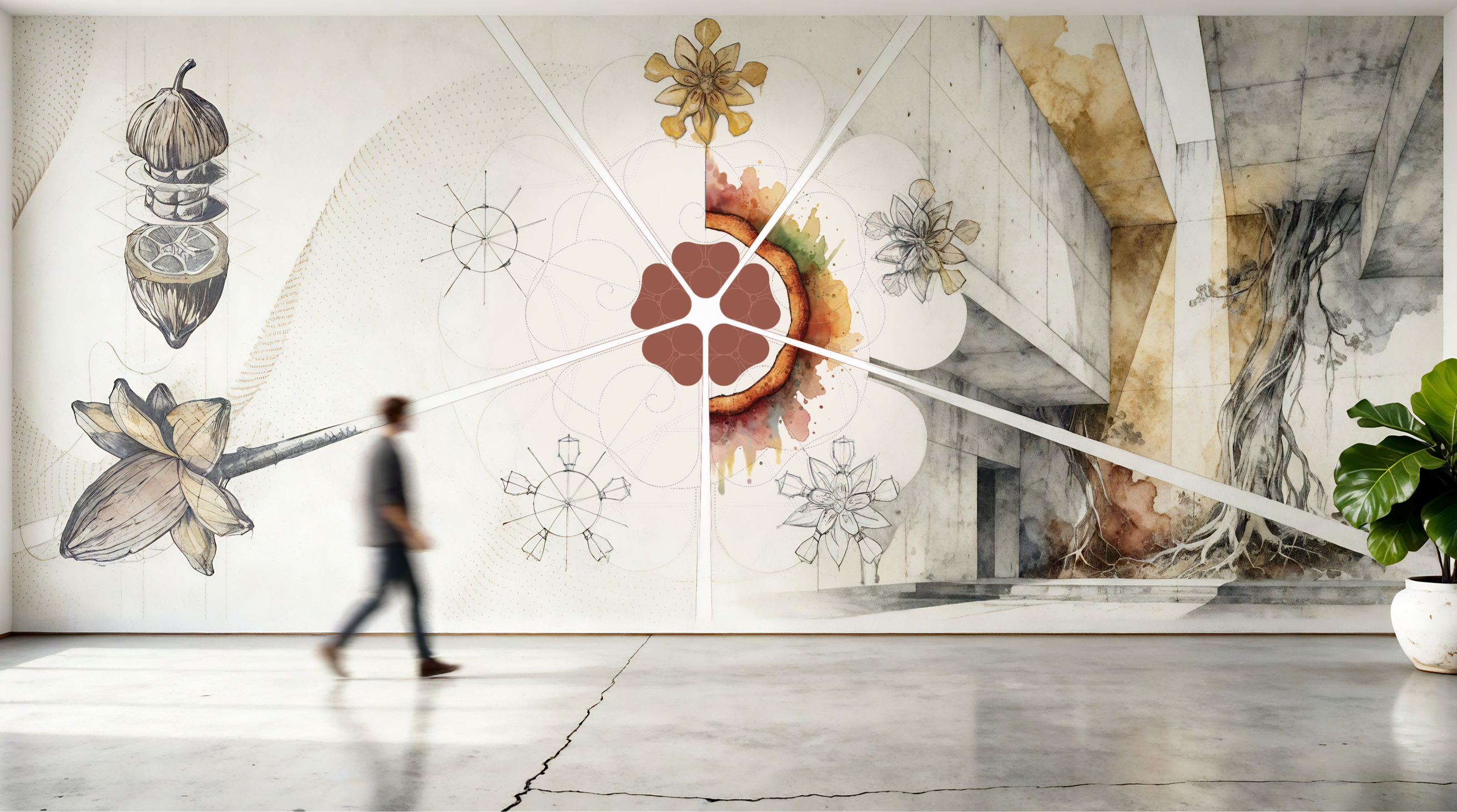
architectural mural, spiritual alignment
So when I was asked to paint a mural for a studio called Cacao, it felt like such a cosmic alignment.
An architectural cross-section of the cacao pod rendered as both science and soul, one half drawn with the precision of a blueprint, the other dissolving into analog watercolor and natural light. It represents the meeting of two worlds: design as the sacred, and the sacred as design. I got to study the stunning cacao flower and draw it through the lens of an architect. The center piece revolves around the logo, with 5 flowers circulating it. These flowers are a study on "how to sketch" a cacao flower from a simple shape to an illustrative art piece. You can grab one of my beloved flower prints here!
This surely wasn't just another project. It was about honoring what happens when art, architecture, and spirit converge. It was about remembering why we create at all.
let's build something that matters
If you’re building something with depth and presence — a brand, a website, a vision — I’d love to help you bring it to life.
"before any design,
you must first
connect with
your heart"
—johnny lemoine
